Little projects: Average age of American politicians

Two stories recently hit my feed:

President Joe Biden is 80. Nancy Pelosi is 82. Chuck Schumer, the Senate Majority Leader, is 72.

It certainly seems like American politicians are getting old — very, very old.

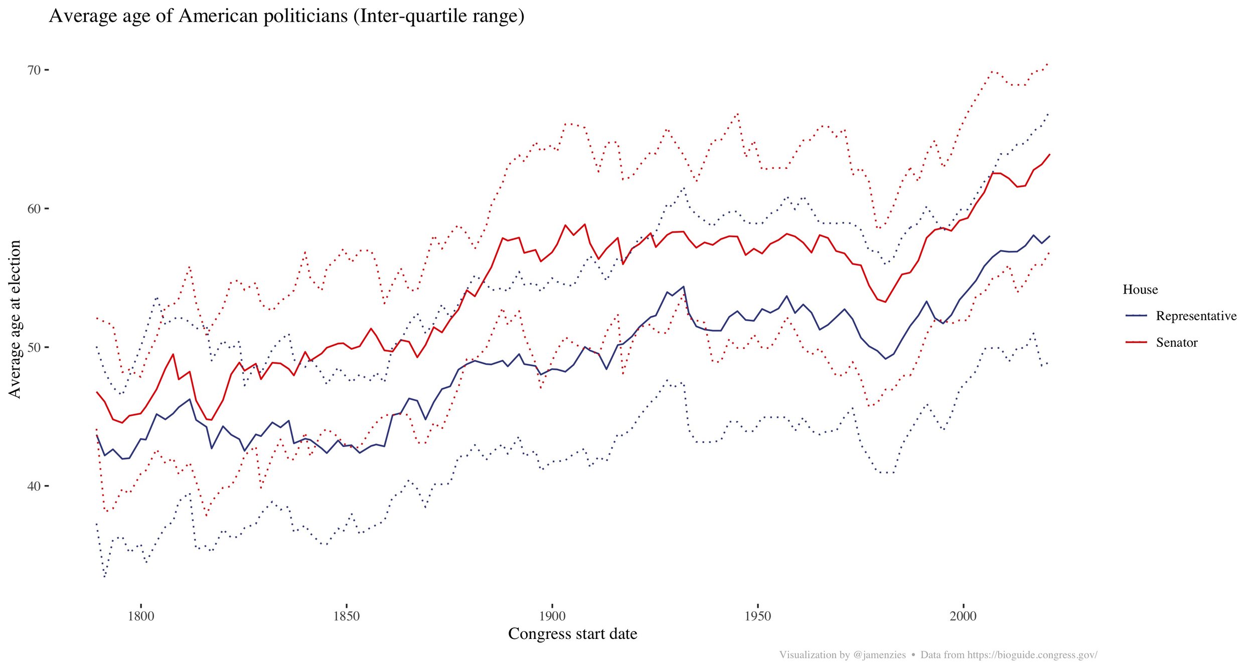
To test whether this is true, I pulled the biographies of every US Senator and Congressman from the Library of Congress. You can too here.

It turns out, yes, American politicians are objectively getting older. But there are a few interesting take-aways form the data.

American politicians have been getting older. But it has occurred in fits and starts: In the 1800’s the average age of Senators and Congressmen was around 45. Senators saw a modest increase in average age over the next 50 years but both Congressmen and Senators saw a large increase in age after the American Civil war.

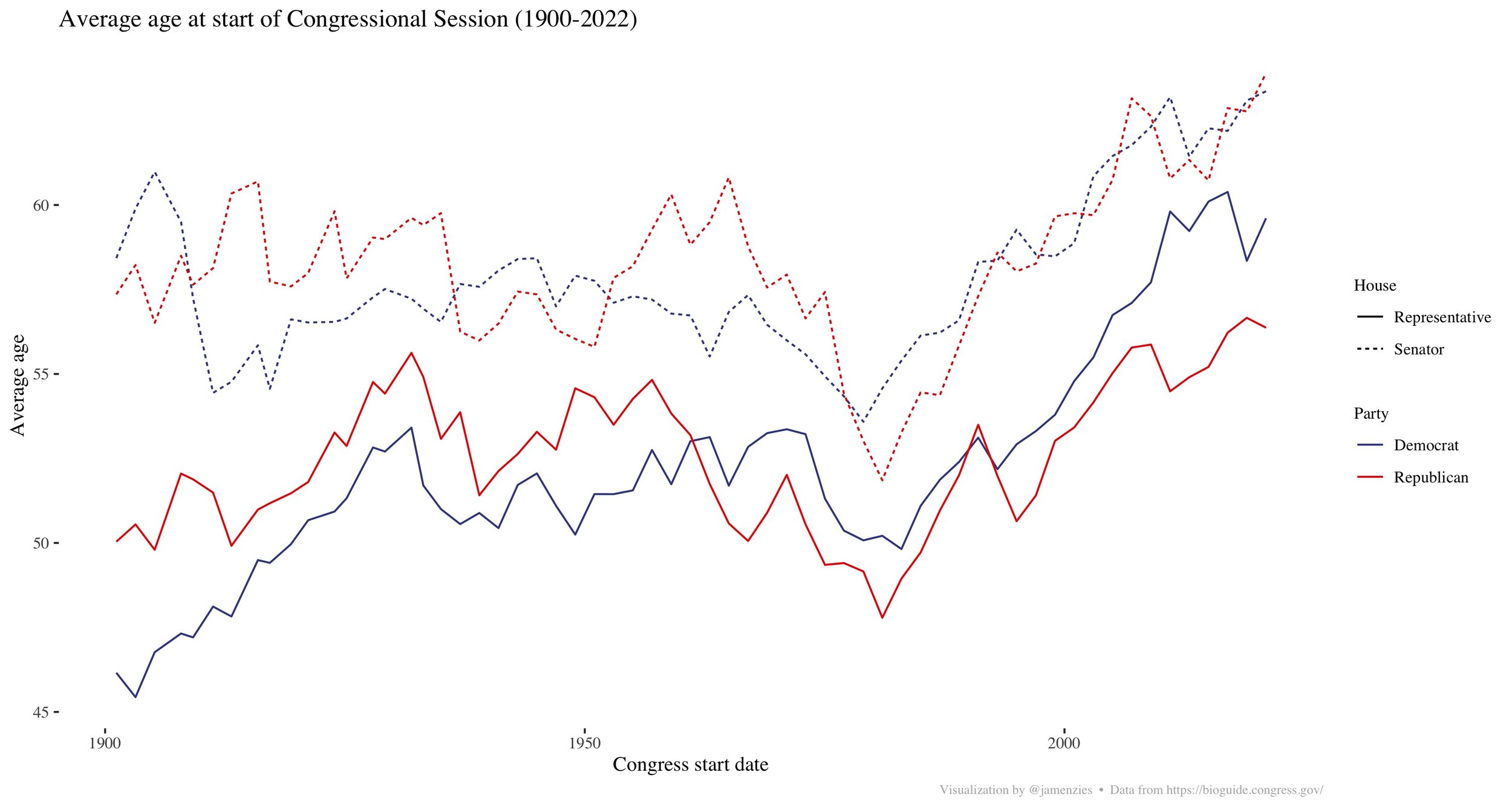
There was another burst in the 1920’s and 1930’s — but then something changed in the late 1970’s / early 1980’s. After a brief dip, both the average age of Senators and Congressmen began an inexorable increase.

Oddly enough, this occurred for both Republicans and Democrats. But is it just because the incumbents keep winning? No.

Although new winners are (on average) younger than incumbents, the average age of new winners has increased 1980 onwards. So what do you think changed?

Little projects: Stable Diffusion on a Mac

I’ve recently started a new job that is much more analytically oriented. I’m going to try creating some shorter posts about odd little analytical projects I’ve been pursuing. All too often I simply don’t share these with anyone.

Recently, the folks at StabilityAI released their Stable Diffusion model, which can be used to generate digital images from text prompts. I got it up and running on my personal Mac following the instructions from this post. (PS - Thank you Ben Firshman for writing the post).

I’ve had a lot of fun with it - some friends have been sending me prompts over WhatsApp to run for them. I’m still learning how it all works but (perhaps unsurprisingly!) it runs rather slowly on my machine (14 inch Macbook Pro, M1 Max, 32GB of RAM).

Below are some of the fun pictures I’ve generated: Picasso horses, 1960’s travel posters (for skiing, to Mars, to the bottom of the ocean), 1950’s magazine ads for the iPhone, impressionist paintings of dancing in a park, and Hieronymous Bosch’s rendition of the NYC skyline, the Canadian parliament, the Mos Eisley cantina, and various Pokemon.

What would you create?

The 2019 Canadian Election: a quick retrospective

With the results coming in for the 2020 American elections, I thought it was an opportune time to do some quick analyses on Canadian election data.

In October 2019, despite a pledge from the Liberals to adopt a more representative electoral system, Canadians went to the polls to elect a new Parliament using the First Past the Post system (FPTP). Although they lost the popular vote, the Liberal Party retained a strong Minority Government, benefitting structurally from their broken promise to remake the electoral system.

The two clear losers in the election were the Liberals (who admittedly held on to power) and New Democrats. Versus their 2015 results, both parties lost seats, absolute vote (despite an increased voter base), and share of vote. Conversely, the Conservatives and Bloc Quebecois improved on all of these dimensions. The Conservatives picked up support, primarily in the West, but were unable to break through in Ontario. In spite of their gains, the perception in the media was that the Conservatives had under-performed and Andrew Scheer resigned soon after the election amid in-party squabbles.

Living as a Canadian expat in San Francisco, many Americans I meet assume that Justin Trudeau must be remarkably popular in Canada. This is not a terrible assumption given his government was re-elected; however, the numbers show that he is not universally supported. Trudeau’s Liberals won only 33% of the popular vote and he had similarly low approval numbers. Many of my American friends are surprised to learn that Trudeau’s approval in Canada at the time of the election (mid-30s) was lower than Trump’s approval in the US (mid-40s).

And yet, despite losing the popular vote to the Conservatives, Trudeau remained the Prime Minister. This is because the FPTP system is similar to the electoral college: by design, different regions are represented disproportionately.

A disproportionate outcome: Liberals lose the popular vote

Like in American Presidential elections, the overall popular vote in Canadian Parliamentary elections is meaningless. The Americans select their President by electing 538 “electors” in 51 separate elections. In Canada, we conduct 338 separate elections across the country to choose Members of Parliament, with districts varying substantially in population. The party with the most MPs forms government, effectively controlling both the legislature and the executive. Due to this regional electoral structure, the national popular vote often differs substantially from the seats in the House of Commons. The 2019 Canadian General Election, however, is the most unrepresentative minority government since WWII.

The Gallagher index, a measure of how unrepresentative an outcome is, for this election was 12.18. By contrast, the US House of Representatives has an index that ranges from 2 to 5. Compared to the US Presidential Electoral College, this Parliament is less representative than any US Electoral College outcome since 1996. As an aside, the below chart shows how the Gallagher index can be misleading: the knife-edge elections (e.g., Bush v. Gore) appear more “representative” than blow-outs (e.g., Reagan v. Mondale). This is because knife-edge outcomes result in a narrowly split Electoral College, while blow-outs result in one candidate carrying nearly all the Electoral College votes (despite only winning by a few percentage points nationally).

Slide6.JPG

Further, even accounting for the convexity of the FPTP system, the Liberal party was able to outperform what would be expected given their national vote. This is because their vote was structurally more efficient than other parties. In particular, incremental Conservative support was “wasted”, being clustered in Western Canada by winning ridings in Alberta with “Saddam Hussein-style” margins. To translate this to the American context, it is much like Democratic support in California: running up the number of Democratic votes in California has no impact on the Presidential election once the state has already been won.

Slide7.JPG

Another way to see the efficiency of the Liberal vote is to look at the seats won per 10K votes cast. Although this metric is somewhat tautological — winners do better — it shows the Liberals have outperformed the other parties in the last 2 elections by capturing seats with fewer votes.

Slide8.JPG

I should stress: high Gallagher indices and unrepresentative outcomes are not decisive evidence against an electoral system. Electoral systems are designed with more than simple majoritarianism in mind, sometimes intentionally giving disproportionate representation to certain regions. There is, however, an irony in the results of the 2019 election: the party that committed to ending FPTP (due to it being unrepresentative) was only able to retain power as a result of a historically unrepresentative election.

Vote splitting: an irrelevance?

Another consideration in the 2019 election was the emergence of a new right-wing party: Maxime Bernier, a disaffected Conservative MP, launched the populist People’s Party of Canada. Historically, a divided Right allowed the Liberal party to govern Canada with little threat of electoral defeat. Although vote splitting with the PPC was a worry for the Conservative party, it does not appear to have had a material effect on the outcome.

Some “back of the envelope” math shows the PPC, at most, directly cost the Conservatives 7 seats. Obviously, this sort of crude arithmetical analysis neglects how the election “narrative” was impacted by this new party but it does show that vote splitting on the right does not explain the success of the Liberals. At the time, I shared this analysis with my friend (and award winning Youtuber) J.J. McCullough who tweeted out:

Slide9.JPG

Had at least 80% of the PPC vote shifted to the Conservatives, the Conservatives would have captured 7 more ridings: 6 from the Liberals and 1 from the NDP. Assuming these gains, the Conservatives would still have been in opposition and Justin Trudeau would still be Prime Minister.

Sensitivity analysis: uniform vote shifting

Historically, only the Liberals and Conservatives have been able to form government under the FPTP system. In order to win a Minority, the Conservatives would have needed 6% of the Liberal base to defect to the Conservatives (roughly 360K votes). To capture a Majority, the Conservatives would have required ~16% of the Liberal voter base to defect, roughly 1 million votes. This implies that, under this distribution of votes, the Conservatives would need ~40% of the national vote to achieve a Majority, while the Liberals could get a Majority with only only slightly more than their 33%.

Slide10.JPG

This asymmetry between the Liberals and Conservatives is partly caused by the weakness of the NDP, a contributing factor to the Liberal victory. In general, it is difficult for the Conservative party to win an election without a strong showing from the NDP and Jagmeet Singh proved a weak leader. Versus 2015, the NDP lost over half a million votes and 20 MPs due to a collapse in Quebec. Had 11% of the Liberal vote switched to the NDP (roughly 600K votes), this would have delivered the Conservatives a Minority government.

The Liberals were the major beneficiary of the FPTP system in 2019. Historically, they have performed well under the FPTP system, which is why it is unsurprising they abandoned their promise to reform it. Given these results, some small-c conservative Canadians might start to consider whether their agenda could be more successfully advanced under an alternative voting system.

Full disclosure: In the Summer of 2007, I interned for Hamish Marshall, the 2019 Conservative campaign manager, in the Prime Minister’s Office and remain close friends with him and his (L)awesome wife. Also, I am friends with Nicholas Insley, who was the candidate for the Conservatives in Coquitlam-Port Coquitlam, one of the seats that the PPC ostensibly cost the Conservatives.

"An incomprehensible formula": The Gallagher index and proportionality in representation

Note: This post was written some time ago (as you can see from the motivation!). Given the “shelter in place” order in San Francisco, I have more time indoors to dedicate to publishing these analyses. Full disclosure: I am close friends with Hamish & Kathryn Marshall — Hamish ran the Conservative campaign in October 2019.

A gaffe in Parliament

After the 2015 election, Prime Minister Justin Trudeau's Liberal Majority government established a Special Committee on Electoral Reform to study possible modifications to the existing "first past the post" (FPTP) electoral system.

This initiative was plagued with problems and the government eventually abandoned it.  For a start, the Minister of Democratic Institutions proposed a committee structure allocating 60% of the voting seats to the Liberals, effectively giving the government the ability to steamroll any opposition.  After objections from the opposition, the government eventually acceded by having the committee reflect the popular vote. 

When the Committee's report was presented to Parliament in December of 2016, the Minister criticized the recommendations due to their reliance on the "Gallagher Index", which she called "an incomprehensible formula" She went so far as to hold up an oversize card with the formula in Parliament.

To be charitable, it is likely that the Minister intended to criticize the report's somewhat muddled emphasis on proportionality.  Regardless, her comments came across as petty and tone-deaf: it was easy for critics to point out that a Minister from the party of "evidence-based policy"— who holds a Bachelor of Science no less — was claiming that a relatively simple formula was "incomprehensible".  Several weeks after this incident, Minister Monsef was reassigned to another portfolio.

What is the Gallagher Index?

The Gallagher index is a simple metric to show how much the outcome of an election (e.g., the seats in the House of Commons) deviates from the popular vote proportions.  That's it.  In fact, it's even got a rather simple formula to describe it:

This is the formula for the Gallagher index (similar to the one Monsef held up in the House of Commons)

where Si the the percent of seats party i won and Vi is their national vote. The index is effectively measuring the "distance" between the popular vote and the outcome in the House of Commons. 

Consider a simple example: suppose there is an election where the Church of the Militant Elvis party receives 10% of the vote and no seats, the Monster Raving Loony Party receives 40% of the popular vote but only 10% of the seats in Parliament and the Rhinoceros Party receives 60% of the popular vote and 90% of the seats in Parliament.  Intuitively, such a result might seem "disproportionate". 

It's reasonable to think that the Monster Raving Loonies were short-changed by 20 percentage points of support (30% minus 10%) and the Rhinoceros Party is over-represented by 30 percentage points (90% minus 60%).  Further, the Church of the Militant Elvis saw none of their 10 percentage points of support represented in the HoC.  Adding up all the absolute deviations between the vote and HoC proportions could give us a measure for how "disproportionate" an election outcome was.  In fact, multiplying that sum by 1/2 would give you the "Loosemore-Hanby index". 

Here is a quick example that shows how the Loosemore-Hanby and Gallagher indices would be calculated.

(As an aside, I am continually amazed how simple metrics are given such fancy names!)

The problem with looking at only the absolute deviations, as in the Loosemore-Hanby index, is that they treat small deviations the same as large ones.  This is an issue since (often) small deviations in proportionality are not very important but larger differences can raise major concerns.  The Gallagher index takes this into account by squaring these differences, which increases the relative importance of large deviations.

If you would like to understand more detail behind how proportionality indices work, please have a look at this longer discussion on measuring (dis)proportionality.  

How does this relate to the Special Committee on Electoral Reform?

One of the recommendations from the Committee on Electoral Reform was that the new system achieve an adjusted Gallagher index of 5 (to be calculated across sub-regions of the country and then averaged into a national score).  This recommendation is vague and poorly explained.  For instance, the only justification I can find for this recommendation (page 69) appears to be an appeal to authority:

According to Professor Becker, a Gallagher Index of less than 5 is considered “excellent”

If you know of any more information on how the committee got "5" as the magic number (or if I just missed it), please contact me.

Since I didn't have all the regional electoral breakouts readily available, I've gone ahead and calculated the national Gallagher index at a National level for every Canadian Federal election since Confederation (1867-2015).  Here are the results for just the post-WWII elections, the rest are further down the page:

The Gallagher index calculated for every Canadian Federal election since 1945. The chart is colour-coded by which party won the election and whether they achieved a majority or minority.

Quick reactions to the data:

  • Our current system typically does not come close to 5 on the national Gallagher index: only a single election since 1945 has done so

  • Liberal and Conservative governments have about the same average national Gallagher index: since 1945, Conservative governments average 11.7 and Liberal governments 11.6

  • Majorities have higher on the Gallagher index than minorities: Perhaps unsurprisingly, Majority governments are less proportionate. Since 1945, majority Parliaments have an average score of 13.4 while minority Parliaments average 8.4. This should be obvious since most majorities are largely a result of the convexity in our first pas the post system - few parties ever achieve more than 50% of the vote yet majorities are quite common. (I've got another post with a chart that clearly shows this)

Here is the Gallagher index calculated for all elections since 1867. It is apparent that the index increases (on average) after the 1920's with the emergence of more political parties (e.g., the CCF, Reform, the BQ, etc.). Six elections after 1920 have indices over 15, while all elections before that were below.

A Gallagher target is not a recommendation

The Gallagher index is an emergent property of a complex system.  It's not like we can turn a dial to reduce the Gallagher index while also keeping other aspects of our system constant.  Recommending that the new system achieve a certain Gallagher score tells us little about how we ought to achieve this outcome.

To use a crude analogy, it is like recommending someone lose weight.  Well, yes, many people need to lose weight - but how?  Will you hit the gym, take up running, eat less, get liposuction? Stating a desired outcome provides little help in designing a future electoral system.

In fact, focusing on a single, highly simplified metric to design a complex institution is missing the point.  Minister Monsef was correct to criticize the vague recommendation from the committee that Canada adopt "proportional electoral system that achieves a Gallagher Index score of 5 or less".  But Minister Monsef got it backwards: it's not that the Gallagher index is too complex, it's far too simple. 

Unfortunately, the report was full of "motherhood and apple pie" recommendations about desirable end states (e.g., increasing voter turnout, electing more women) but remained silent on concrete proposals to reform the electoral system.  A Gallagher target is not a reform.

Canadian National Polling trends heading into the 2019 election

We are quickly approaching the 2019 Canadian election: it is scheduled for October 21, 2019 and the campaigns are heating up. For those interested in following the “horse race”, Éric Grenier (CBC) has produced an interactive tool that projects the distribution of the seats in the House of Commons based on public polls. Well worth checking out!

After seeing Éric’s tool, I decided to quickly update my “Poll of polls” and rerun the time series analysis from an old post. It now spans almost two decades of polling data (from mid-2002 until today).

This time series of Canadian national-level polls runs from mid-2002 until August 2019

There are a few interesting recent trends since my last post:

  • The Liberals, having apparently overcome the negative stigma of the SNC Lavalin affair, are neck-and-neck with the Conservatives going into the 2019 election

  • The Green party has increased its support (presumably at the expense of the NDP) to levels not seen since 2011

  • There is a new party in town — the People’s Party of Canada, run by Maxine Bernier — but I’ve left them off the chart (for now) because they clearly have <5% of national support

As the chart clearly shows, elections matter: a lot can happen between now and late October.

All that being said, it’s important to remember that the national popular vote is utterly meaningless in our electoral system! Winning seats is what counts.

Full disclosure: In the Summer of 2007, I interned for Hamish Marshall, the 2019 Conservative campaign manager, in the Prime Minister’s Office and remain friends with him and his (L)awesome wife.

Creative destruction: The fragmentation and consolidation of Canadian political parties (2/2)

Note — After sharing an earlier version of this post with my friend JJ McCullough, he noted that many historical sources on Canadian election data differ considerably: you need to be careful about what sources you pull from.  He has produced a wonderful website on Canada (The Canada Guide), which also covers historical elections.  You should check it out!

How many parties are there?

The previous post got me thinking: it's clear that the number of political parties has increased over the last century but how can we quantify this?  Counting the number of different candidates running is unsatisfactory since that includes all sorts of irrelevant parties (e.g., the Communist Party of Canada).  Instead, we can calculate a quick metric known as the "effective number of parties".

To calculate this, sum the squares of the support that each party achieved and then invert the total.  In economics, this method is a quick-and-dirty (although very dated) way to look at the competition in a given market: the more “effective firms” (or parties), the more competition.  In short, this metric gives an indication for how many political parties people have either voted for or are taking seats in the House of Commons.  

The chart below shows two things: the top panel shows the effective number of parties that Canadians voted for, while the bottom panel show how many political parties took seats in the House of Commons. I've calculated this for every election since 1987 (using data from the Library of Parliament):

This plot shows the effective number of parties for each election. The top panel shows the effective number of parties based off the votes, while the bottom panel shows the effective number of parties that show up in the House of Commons. The average for each era is in the oval.

Eyeballing the data, there appear to be three eras in Canadian politics (also discussed in a previous post).  I've coloured these in black, blue, and orange.  From 1867 until 1917, Canadians voted for ~2 political parties and ~2 political parties showed up in the House of Commons (2.1 and 1.9 respectively, to be precise). 

But from 1920 until 1990 this changed: Canadians voted for roughly 3 political parties and only 2.4 showed up in Ottawa.  After 1990, this became more extreme: Canadians voted for 3.7 parties but only 2.8 showed up at Parliament.  What's going on?

For every incremental effective political party that Canadians voted for, only ~0.5 effective parties show up in Ottawa.  I've shown this in the scatter plot below.

The data shows that, over time, Canadians have voted for more political parties but, although there are now more political parties entering the House of Commons, this is not fully reflected in Parliament's composition.  The reason for this is the convexity inherent in our first past the post system: smaller parties are typically under-represented, while larger ones are over-represented. 

Each dot in this plot represents an election (they are colour-coded by dated). This plot shows that as Canadians vote for more effective parties, the effective number of parties in Parliament increases, but at a slower rate.

A desirable property of FPTP?

I don't think the above trend (alone) is sufficient to warrant worrying about under-representation — in fact, it shows a desirable (and often forgotten property) of the FPTP system: the incentive to merge political factions into larger parties.

Party mergers and breakups are quite common in many political systems. However, in First Past the Post system, the convexity of the system provides an in-built incentive for similar political factions to resolve their differences and present a united front to the electorate. Two similar parties that each receive 15% of the vote will typically have fewer seats than a single party that achieves 30%.  This was the major incentive for the Canadian Alliance and Progressive Conservatives to overcome their differences and form a united Conservative Party in 2003.

This dynamic is often ignored when discussing whether we should adopt a Proportional Representation (PR) system: under PR systems (like in Israel or the Netherlands), factions have little incentive to overcome their differences before an election. Instead, they formally negotiate their differences after an election in order to form government (sometimes this takes a significant amount of time).  Had Canada adopted a PR system in the early 2000's, I doubt the Progressive Conservatives and Canadian Alliance would have merged.  Further, if we adopted PR today, there is no reason to think the Conservatives (or any of the other parties) would necessarily remain united. 

This is not to say that PR is inferior or superior to FPTP; however, the two systems differ in their incentives to create new political parties. PR allows for the existence of small parties, while FPTP incentivizes the creation of “broad churches” from many political factions.

The dynamic process of creating new political parties, destroying old ones, and merging similar ones is akin to creative destruction.  Ignoring party formation in analysis of changes to the electoral system is a bit like analyzing a market under the assumption that there will be no more technological improvements or that the current major players will always be on top.  It might give some insight into what could happen in the very short run but it won't tell you anything about how the new system will behave.

Creative destruction: The fragmentation and consolidation of Canadian political parties (1/2)

Note — After sharing an earlier version of this post with my friend JJ McCullough, he noted that many historical sources on Canadian election data differ considerably: you need to be careful about what sources you pull from.  He has produced a wonderful website on Canada (The Canada Guide), which also covers historical elections.  You should check it out!

Mergers and acquisitions

The creation of new parties and the mergers of old ones is a perfectly normal part of the Parliamentary system and one that is sometimes overlooked:  in discussions on electoral reform, it's tempting  to focus on which party today would benefit from a proposed change (after a quick Google, here is an example).  Although these articles can be fun speculation, there is a problem with this sort of analysis: it assumes today's political parties will remain static even after some fundamental change to the voting system.  

Over the course of two short posts, I want to show you a longer time series of Canadian elections and a couple quick cuts of the data to show how parties rise and fall.  Their emergence (and destruction) is a crucial part of the "first past the post" (FPTP) system — in fact, a crucial part of any democratic political system!  Ideological (or other) movements must iron out their difference and coalesce into a well-organized party so as to present the country with a coherent and unified option for Government.  These "broad churches" are themselves smaller deliberative bodies, where different factions must compromise.

When factions cannot find reasonable compromise within an existing party, they can start their own.  This is what happened when Lucien Bouchard left the PCs to form the Bloc Quebecois or when Preston Manning (and others) founded Reform.  The converse is also true: Stephen Harper and Peter MacKay merged the Canadian Alliance and the Progressive Conservatives, which created the Conservative Party in 2003.

Even over the last decade there has been plenty of speculation on whether the Liberals and NDP should merge (here is but one example).  

Federal votes and election outcomes

I've pulled the historical Federal election outcomes since Confederation from a variety of sources (although mainly from the Library of Parliament).  Below are two plots: the top one shows the distribution of seats from every election since 1867, while the lower one shows the popular vote percentages.

I have ordered the parties (roughly) so that the Conservative / Right-wing parties are near the top of the chart and the Liberals are at the bottom.   Since these are the only two parties that have held government, this should show the back-and-forth between them over time (in particular, whenever one crosses the white 50% line).

This first chart (above) shows the distribution of seats in the House of Commons after every Federal vote coloured by political party. It is easy to see the Liberal and Conservative majorities as they cross the white horizontal 50% line.

This second chart (above) shows the distribution of votes coloured by political party). There are few cases where any political party gets over 50% of the vote (these cases are mostly when there were only two major parties from 1867-1917)

A few quick reflections from these charts:

  • After the 19th century, majority governments have been common but majority popular votes are not: since the rise of >2 major political parties, there has only been 2 elections where a party received the majority of the popular vote

  • The distribution of seats is more volatile than the distribution votes: this shows the convexity that emerges from our voting system - small changes in the vote proportions lead to large changes in the seats (I have another post on this topic.)

  • There appear to be two major "fragmentation moments" in Canadian politics over the last 150 years:

    • ~1917 (onward): The rise of the Progressives, Social Credit and other parties (CCF, New Democracy)

    • ~1990: The fragmentation of the political right and the rise of separatism

  • Political fragmentations take years to resolve: after the break-up of the Right in the 1980s / 90s, the Liberals achieved four mandates (three majority and one minority) before a Conservative party took government

In a future post, I'll show some more detail on how the the “number” of political parties has increased over time.


The magic number: What’s with the fixation on 40% for a majority?

A common trope from the Canadian commentariat is that 40% national support should result in a majority government (see here from Nanos Research).  I’ve always been skeptical whenever a journalist trots out "rules" like this since they often ignore the complexities and subtleties of our system.

But 40% does seem roughly right: the last two majority governments received just above 39% of the vote. 

To test this, I've taken all the elections since 1945 to see the relationship between the popular vote received by each party and the proportion of seats they won in the House of Commons:

Each dot in this plot represents a single party's outcome in an election (e.g., in 2015, the Conservative Party won 32% of the national vote and got 29% of the seats in the HoC).  This plot shows that the relationship between the national vote and seats in the HoC is convex: smaller parties are under-represented, while larger ones are over-represented.  This attribute makes it easier to form majority governments since a party can win 50% of the seats with fewer than 50% of the votes. 

Looking at the data and fitting a quadratic line** shows that when a party gets 40% of the national vote, they should expect to get roughly 50% of the seats in the House of Commons.  The "40% for a majority" rule-of-thumb is pretty good! 

But there is another interesting pattern in the data: the relationship is quite clearly convex. That is, if you get below 30% of the national vote, you should expect to be "under-represented" in the House of Commons.  If you score over 30% of the national vote, then you should expect to get a disproportionate number of the seats in the House of Commons.  (This is shown on the chart as being above or below the 45 degree line - if you are on the 45 degree line, your national vote percent and representation in the HoC are the same)

This demonstrates that larger parties have an advantage in the FPTP system: two smaller parties that each get 20% of the national vote would expect to elect fewer MPs than a united party that gets 40% of the vote.  This provides a strong incentive for parties to unite and create broad coalitions (instead of smaller fringe parties).

Another implication is that relatively small differences in vote can result in large differences in the House of Commons.  Consider the current situation in Canada: the Liberals got just shy of 40% of the vote and received 54% of the seats in the House.  The opposition Conservatives got 32% of the vote and 29% of the seats.  An eight percentage point difference in vote results in a 25 percentage point gap in representation in the House of Commons. 

Put another way, changes in the House of Commons should be much more volatile than changes to the national vote.  This is very clear in the data, but that will be covered in a future post.

** An older version of this analysis on this site used a Loess regression.  I couldn't be bothered running the code again so just did this analysis in Excel using a polynomial regression.  The result is very similar and the conclusion doesn't change.

A week is a long time in politics: 14 years of Canadian polling data

This post’s title is a saying often attributed to Harold Wilson, the British Labour Prime Minister who served in the 1960’s and ‘70s.  Although the origins of the quote are unclear -- Wilson did not recall ever saying it -- the meaning is not: fortunes in politics are subject to rapid rises and falls.  This is, no doubt, very true in Canada.

In this first post, I want to show you a straightforward time series of Canadian political party support over the last 14 years.  To my knowledge, it is the longest single time series of Canadian political polls. 

This period coincides with the creation of a united Conservative party, the secular decline of Quebec separatism, the “coalition crisis” of 2008, the “Orange crush” collapse of the Liberal vote in 2011, and the subsequent Liberal majority in 2015.  It spans four Liberal leaders (Martin, Dion, Ignatieff, and Trudeau), three NDP leaders (Layton, Mulcair, and Singh), and two Conservatives (Harper and Scheer). 

With all that laid out, here are some quick high-level points that emerge from this national picture:

  • Changes in national political support have “fat tails”: party support can appear relatively stable for long periods of time before suddenly shifting.  To put this another way, political support is subject to “Black Swan events” where the magnitude of shifting support can dwarf any smaller variations previously observed.  A clear example of this is the rise of the NDP in the 2011 election: if you look at the data leading up to the 2011 election, it would be nigh impossible to predict the NDP surge, which is well above any historic highs they ever achieved.  In fact, it appears as if the Liberals and NDP quite literally swap 15 points of support in a single week!  Which leads to the second point…
  • Election campaigns matter: major shifts in the political environment coincide with election campaigns.  Whether it’s the Conservatives overtaking the Liberals (2006), the NDP and Liberals swapping (2011), or the Liberals overtaking both the Conservatives and NDP (2016), there are many examples where support for the parties changes radically from the start to end of a campaign.
  • Party leadership conventions move polls: Just eye-balling the chart shows that new leaders often get a bounce when they’re nominated.  Dion saw a ~5ppt bump, Ignatieff was probably closer to 10ppt, Mulcair got ~5ppt, and Trudeau saw a sustained ~10ppt step-up in support.  Although it might be too soon to tell, Scheer and Singh appear to have much smaller bumps in comparison.

With all that being said, anyone familiar with Canadian politics knows that the national support for a party is actually a rather meaningless number.  The actual outcome of the election is determined by the individual electoral districts (like the US electoral college).  For instance, the Bloc Quebecois has little support nationally yet they play a disproportionate role in our politics due to their regional concentration.  Similarly, the Green party is a national irrelevance because their support is so dispersed. 

In short, what’s probably more interesting is what this picture doesn’t show: our political system is highly regional and this can have profound effects on electoral outcomes.   As a continuing series of posts on this blog, I hope to lay out some of my thoughts on how our election system can be modeled.


How to read the chart:

  • Each party is represented by a colour: Liberals are red, Conservatives are blue, the NDP is orange, the Greens are green (surprise!), and the Bloc is purple
  • Each of the lightly coloured dots represents a single poll published by a polling agency
  • The coloured lines and bands represent a smoothed average of these polls over time (using a Loess regression.  I’ll probably explain how this works in a future post.  For now, I want to avoid too much maths)

Sources: Over the years, I have manually tracked publicly reported polls.  In recent years, I have started also relying on Wikipedia to make sure I have not missed any polls.  You can easily access the Wikipedia data here.